THE ROLE
From associate UX designer to lead UI designer.
I joined Staples in January 2015. The first year was staples.com: turning the UX team’s wireframes into finished screens for the cart, checkout and sign-in. From mid-2016 I worked on design.staples.com, the print and design store, and led the UI side of rebuilding it from the ground up.
2015–2016 · STAPLES.COM
Screens for the core shopping flow, working from the UX team’s wireframes.
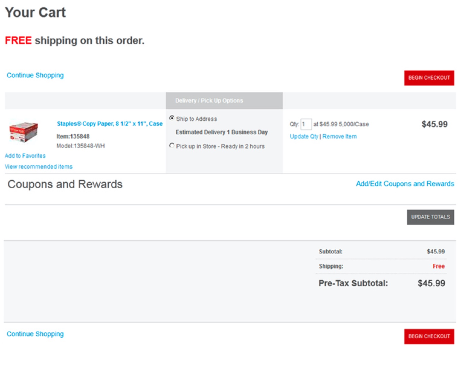
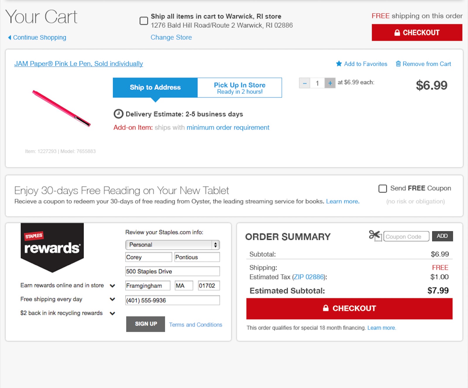
01 · CART
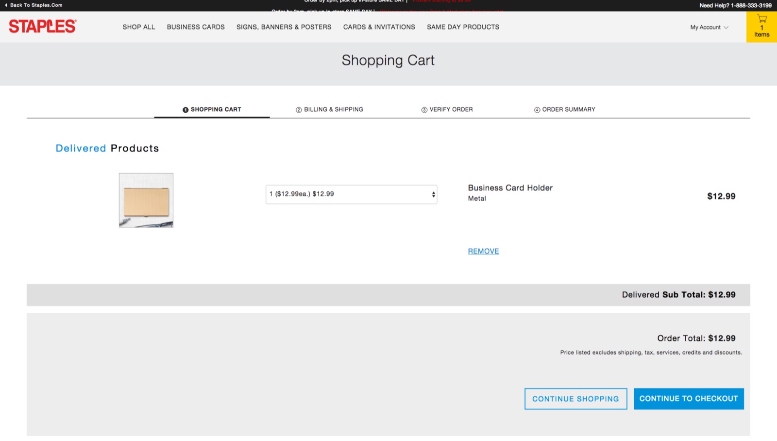
One of my first projects. The UX team handed over wireframes and I designed the finished screens. There was no style guide yet, so I pulled the styles off the live coded site by hand and rebuilt them in Photoshop, which the team still used for layouts at the time.
With the UX team UI · Omer Waiz
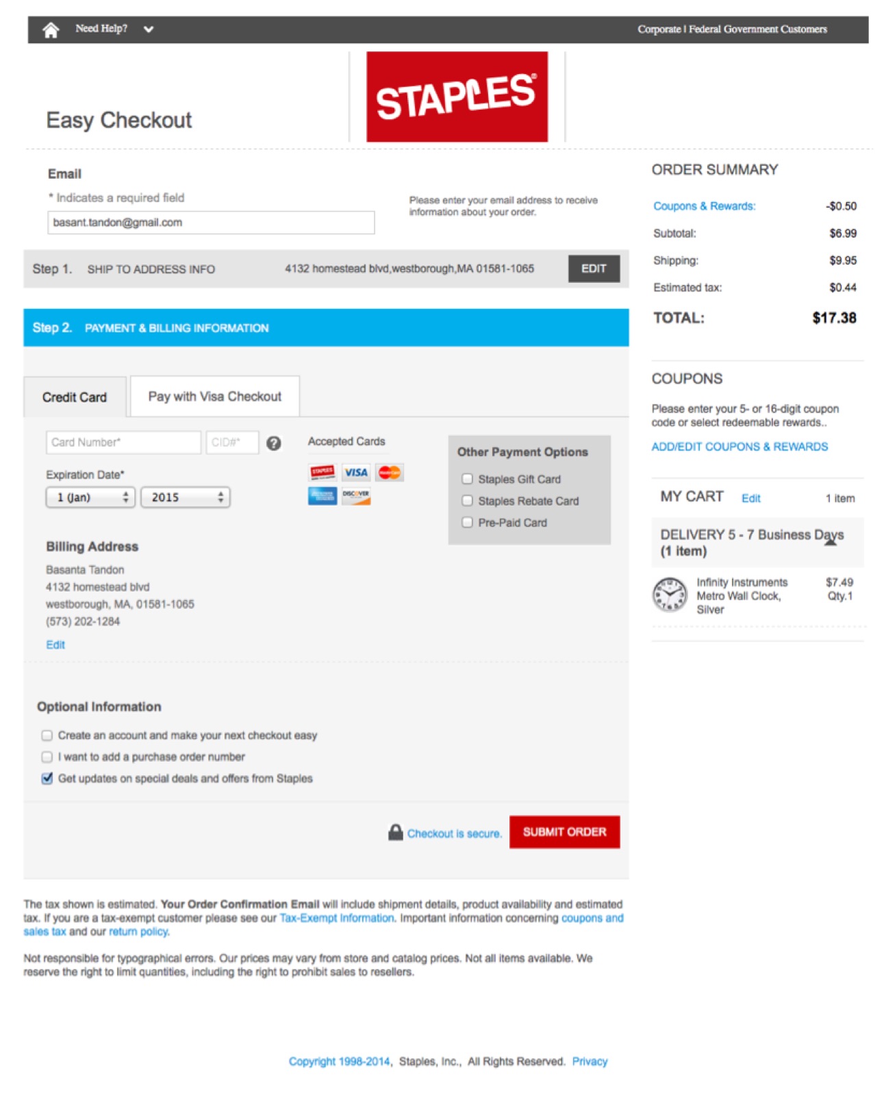
02 · CHECKOUT
Next came checkout, from October 2015. It took many rounds and moved slowly, but it is also where I moved from Photoshop to Sketch, with help from a mentor on the team. The new checkout launched in May 2016.
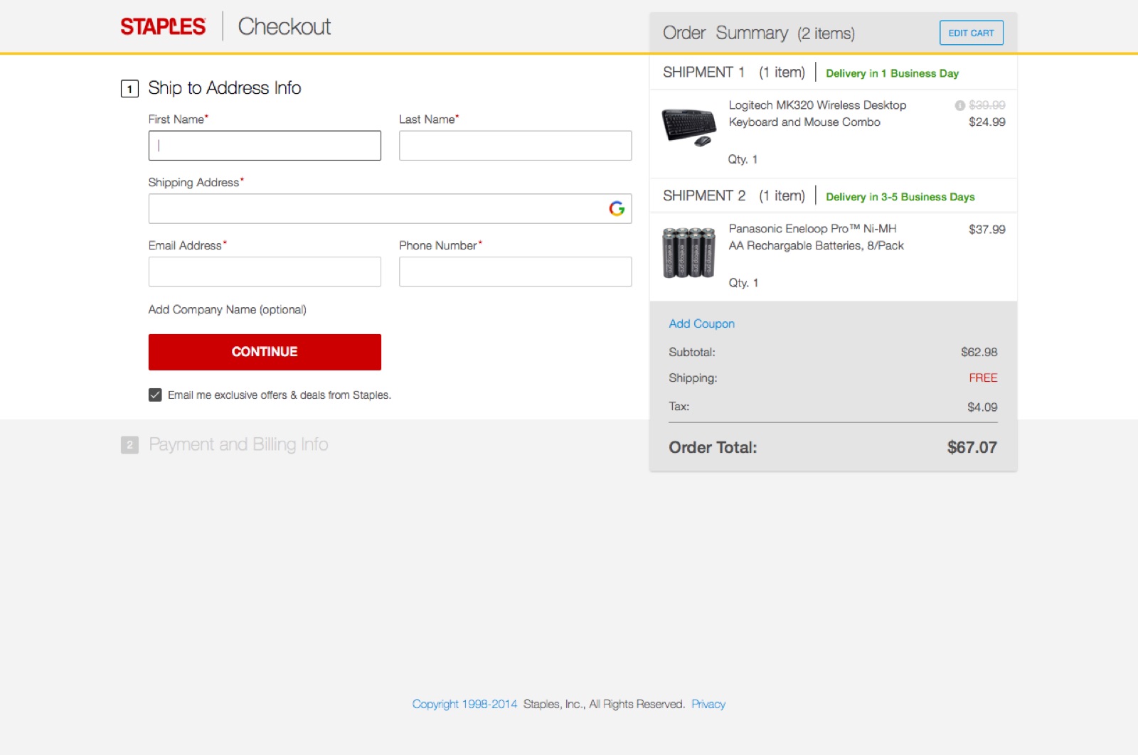
With the product and UX team UI · Omer Waiz
03 · SIGN-IN AND REGISTER
The team couldn’t agree on how the information should be laid out. The old path ran from the header to a sign-in box to a registration form with 16 fields. We made three options. The first two were directed by the Product and UX teams. The third was mine: the strongest parts of the wireframes, with my own decisions on how to present them. All three went to the company’s executives, who chose option 3. It went live.
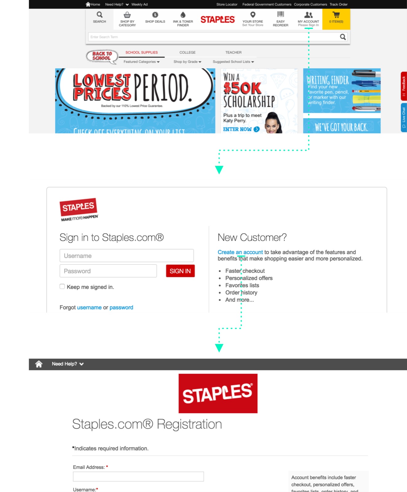
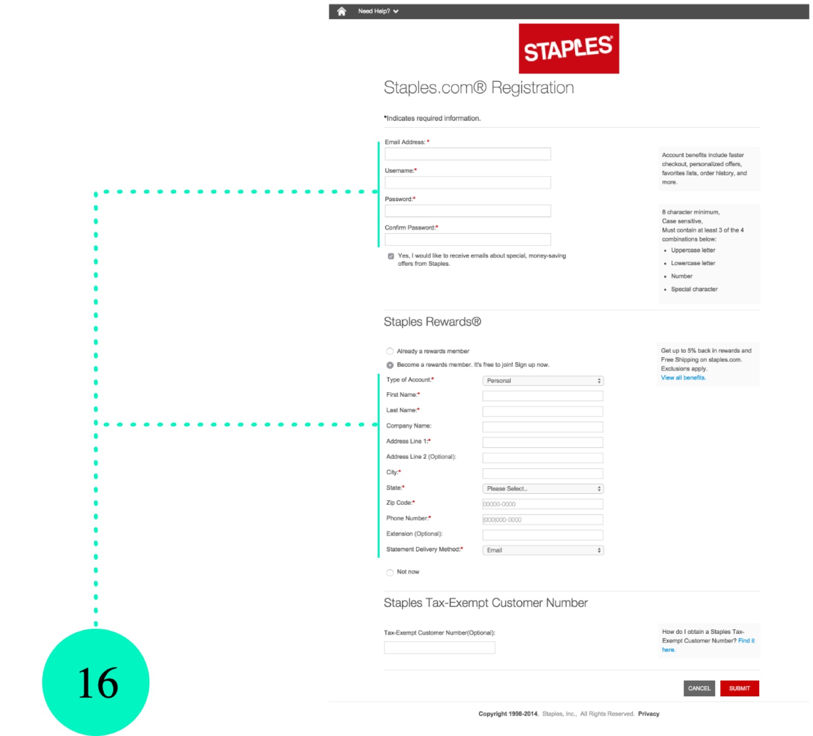
UX and UI · Omer Waiz
2016–2018 · DESIGN.STAPLES.COM
The print and design store: an audit, a new grid, then a 12-month refresh.
04 · THE AUDIT
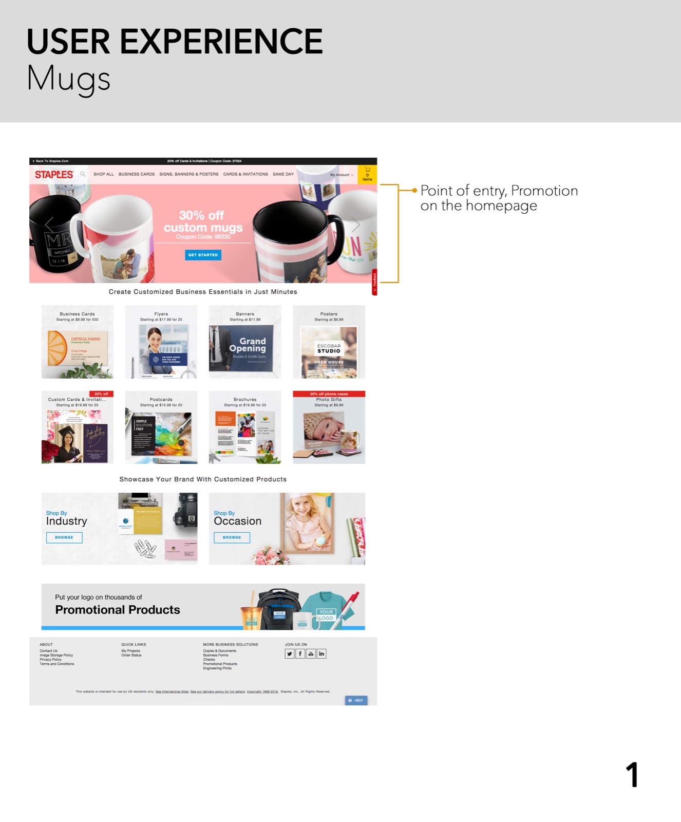
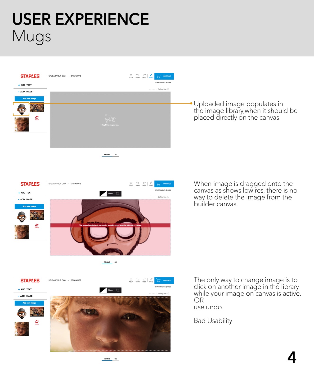
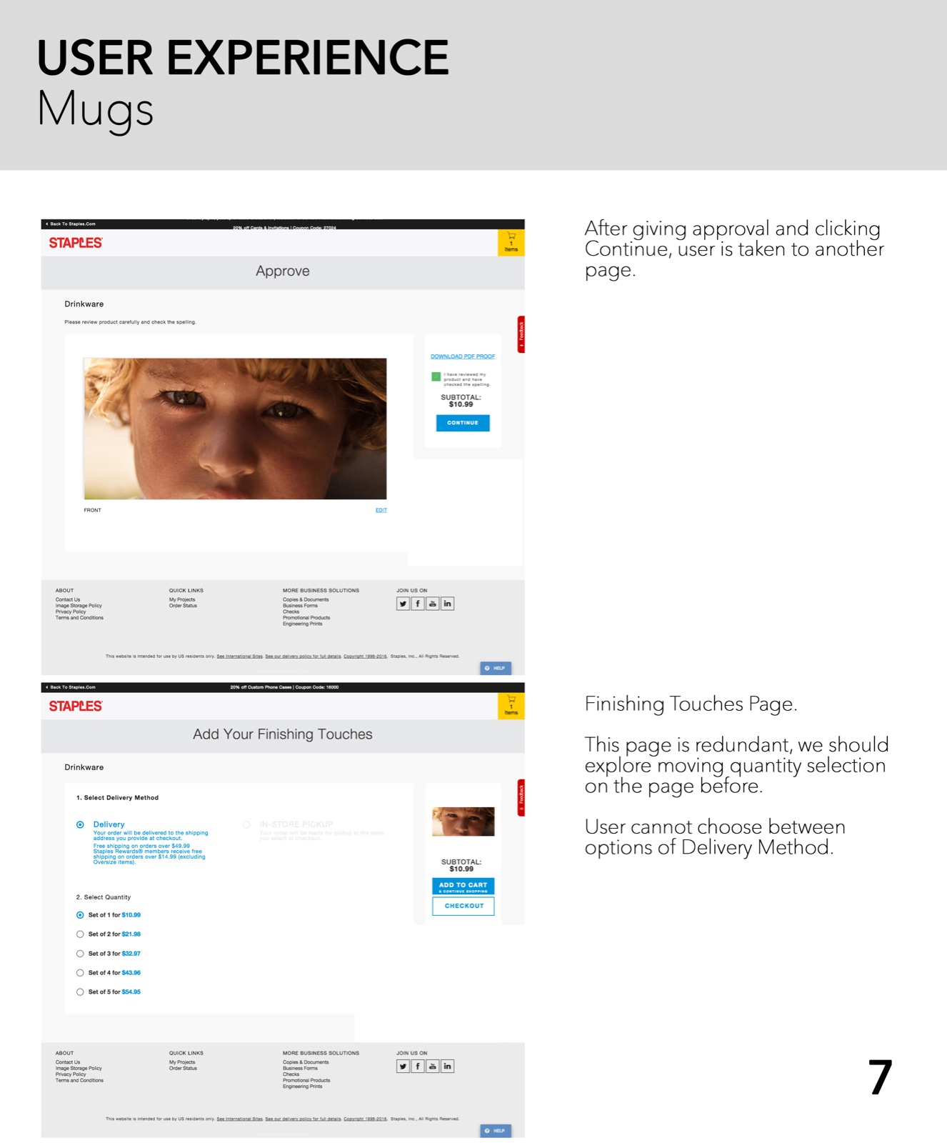
In mid-2016 I joined the design.staples.com team, and my first job was to audit the site. I spent days clicking through every product, every use case and every way in and out of the site, noting what got in the way. The work grew big enough that it was split across a larger team. These sheets cover one product: custom mugs.
05 · WHAT WE INHERITED
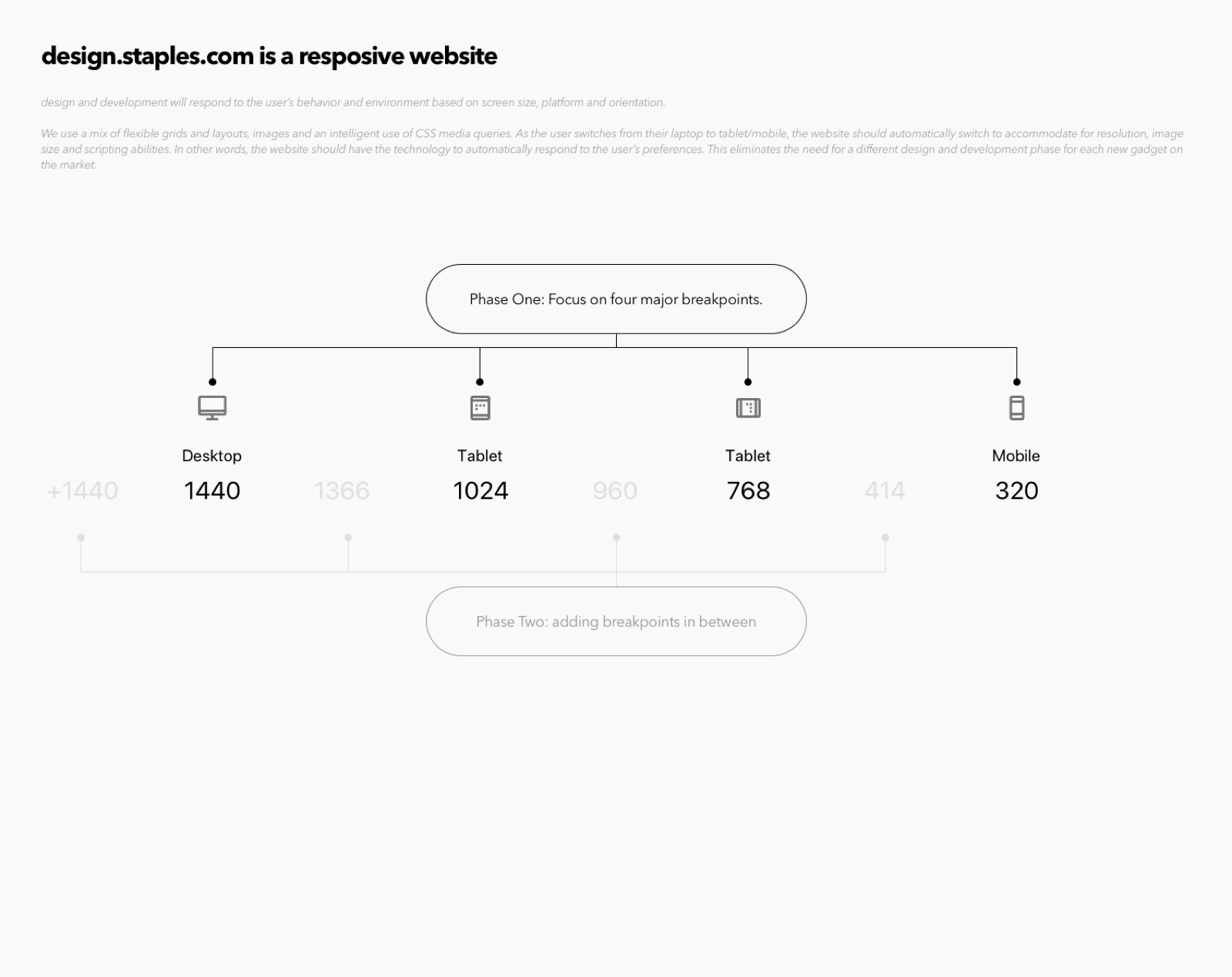
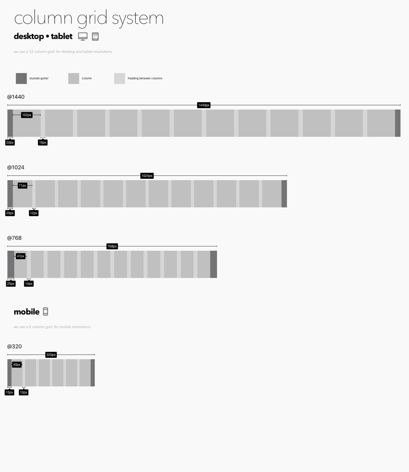
The site already had a style guide, but developers owned it and nothing in it could change. New pages had to be built from the existing components, and they came out looking weak. The grid was the other problem: it was percentage-based and stretched from 2000 px down to 480 px, so components jumped in size at small changes in screen width. We replaced it with a grid built on four breakpoints, chosen from the analytics on the screens our customers actually used.
06 · THE LIST
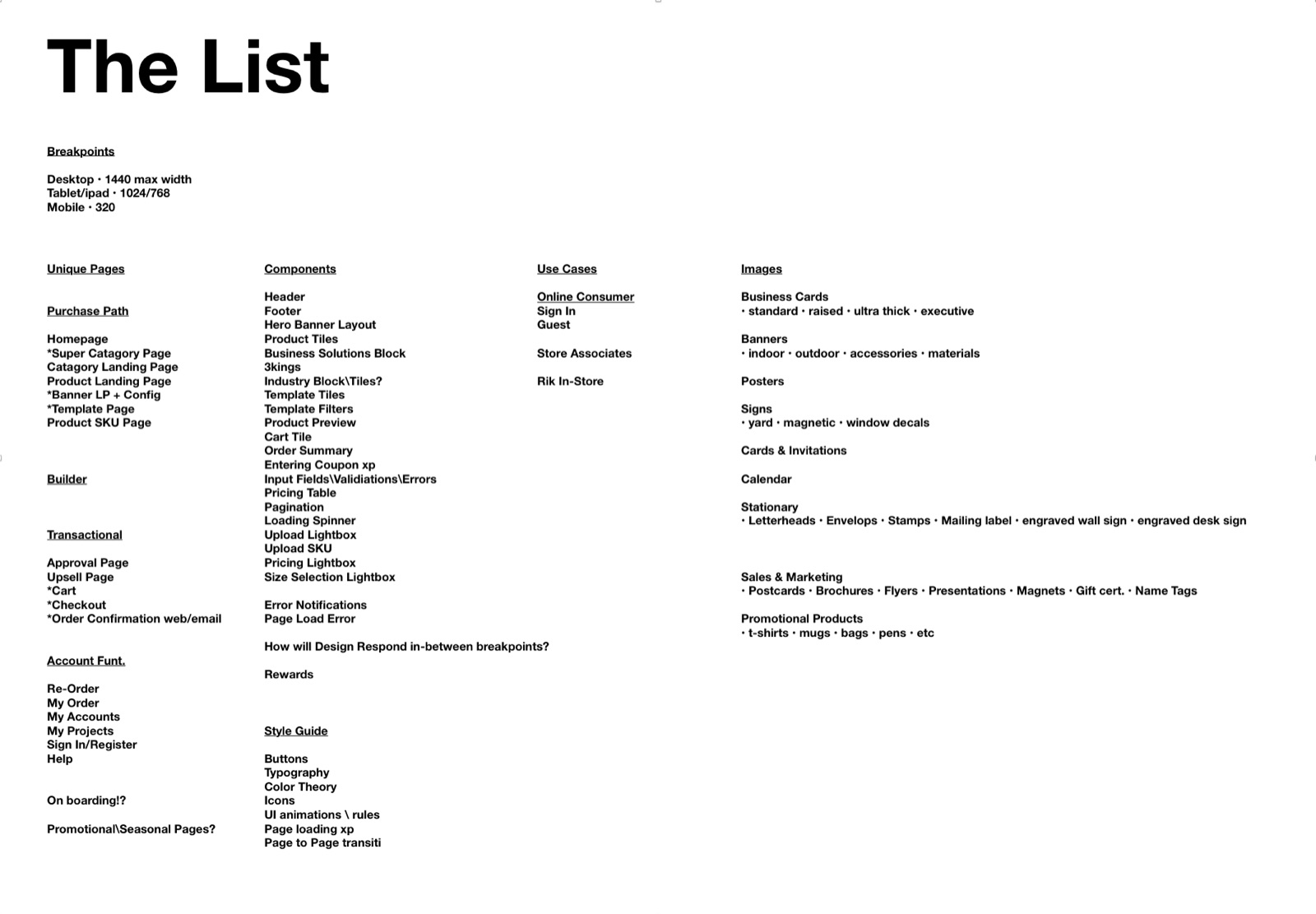
When the CTO approved a redesign of the whole front end, the job had to be broken down first. I went through every page of the site and sorted what I found into breakpoints, pages, components, use cases, images and styles. That list became the plan for the refresh.
07 · THE REFRESH
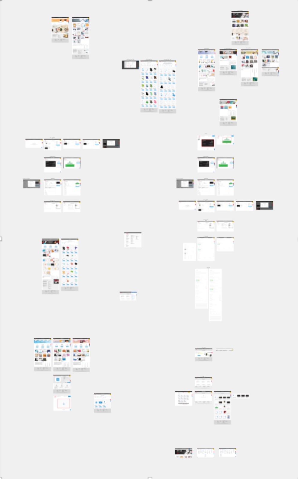
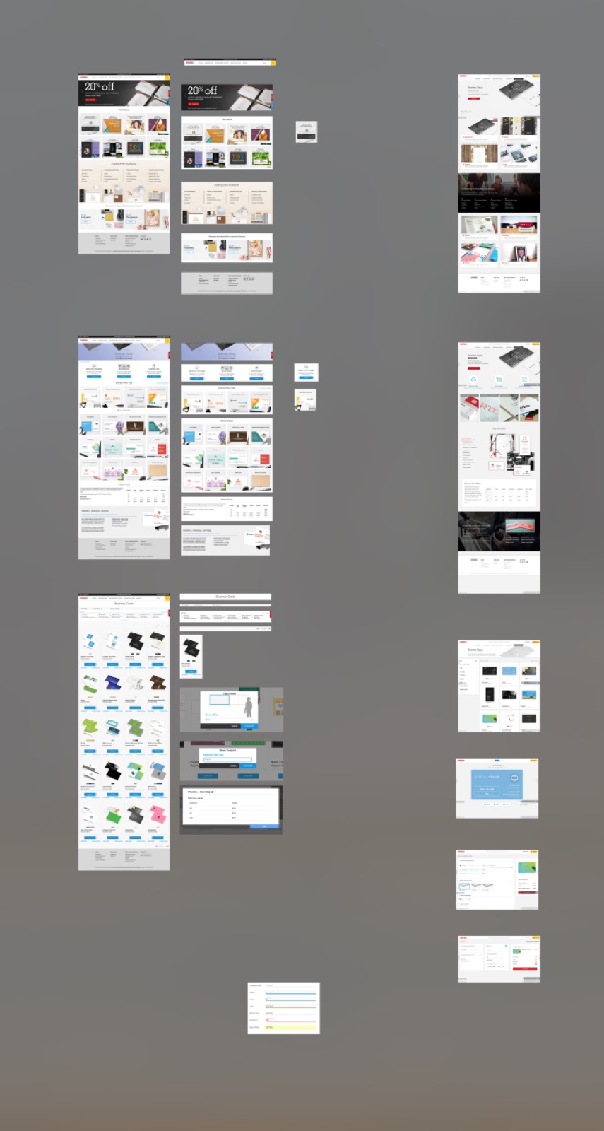
From start to finish the refresh took 12 months. My manager and I brought in a contract designer, who worked with us every day for about three months to set the new look. The work ran in two blocks: first the design, then turning it into specs developers could build from. In the end there were 27 component sheets, from the header to the footer. Then we worked with the front-end developers to bring them to life. The new site launched in February 2018.
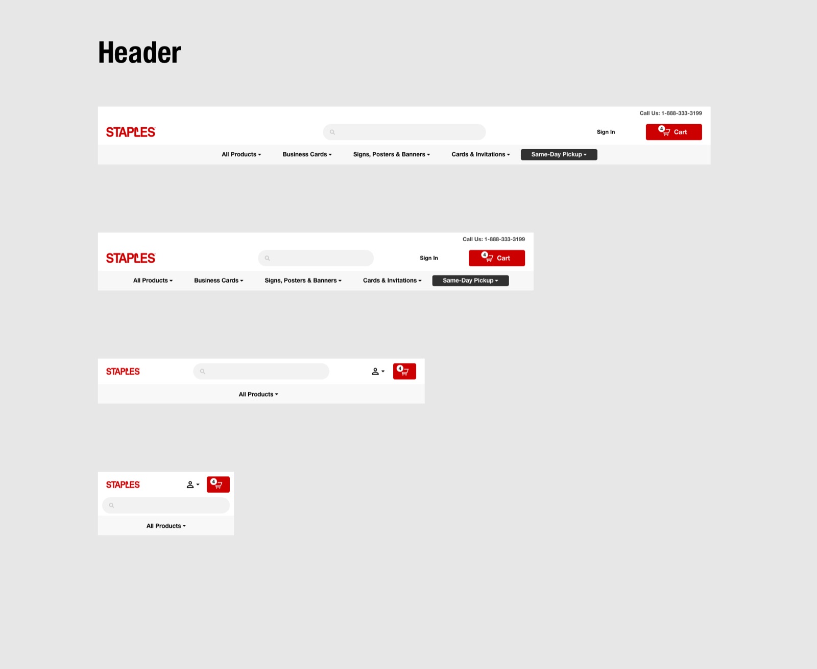
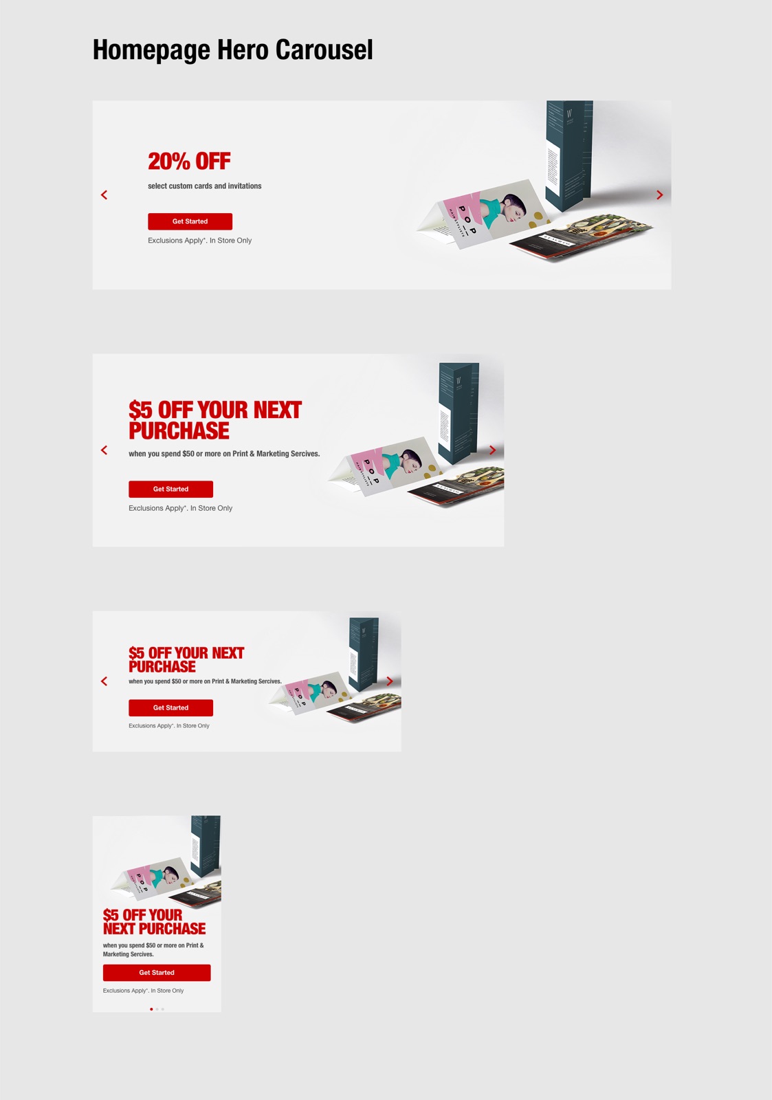
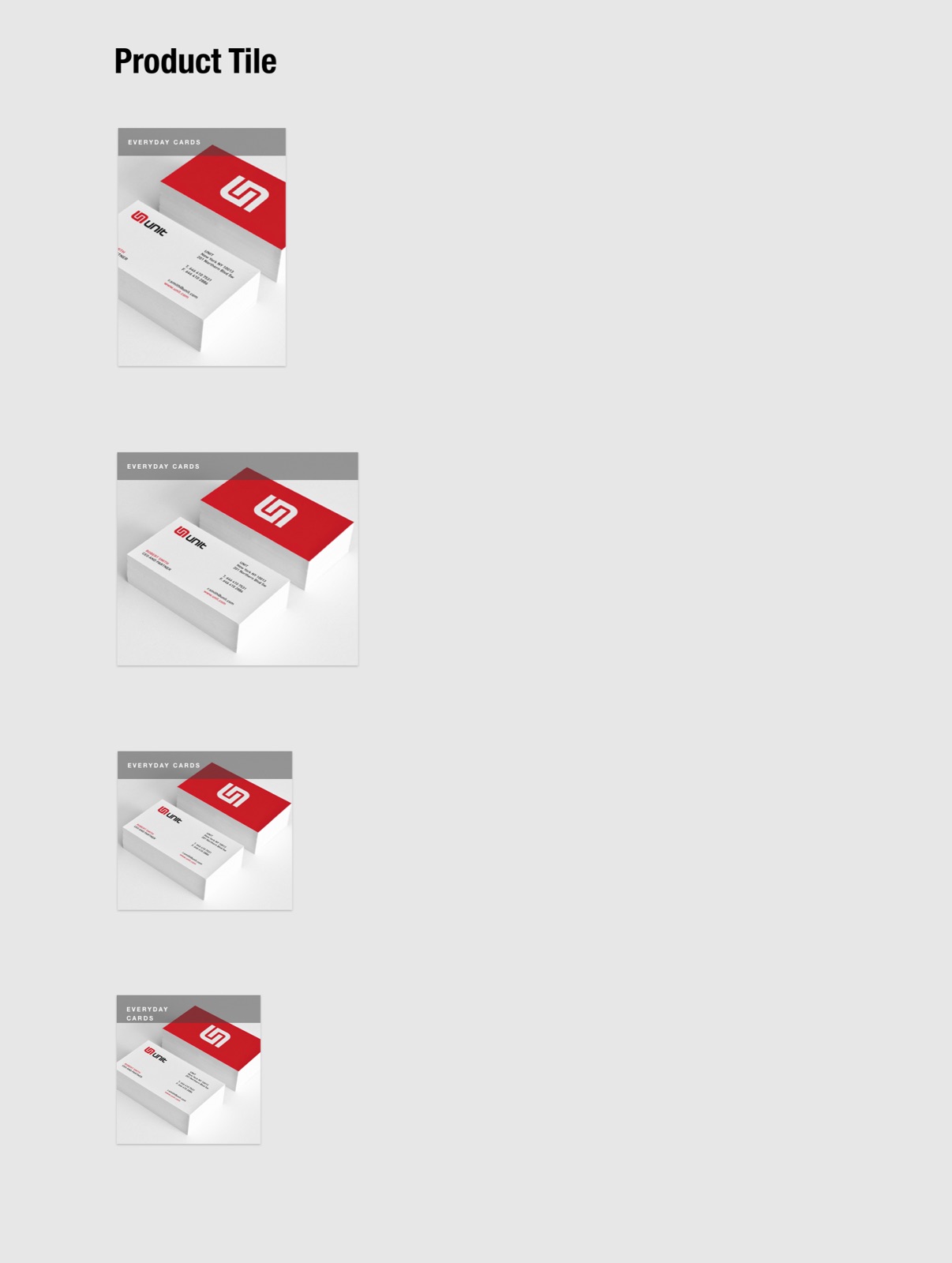
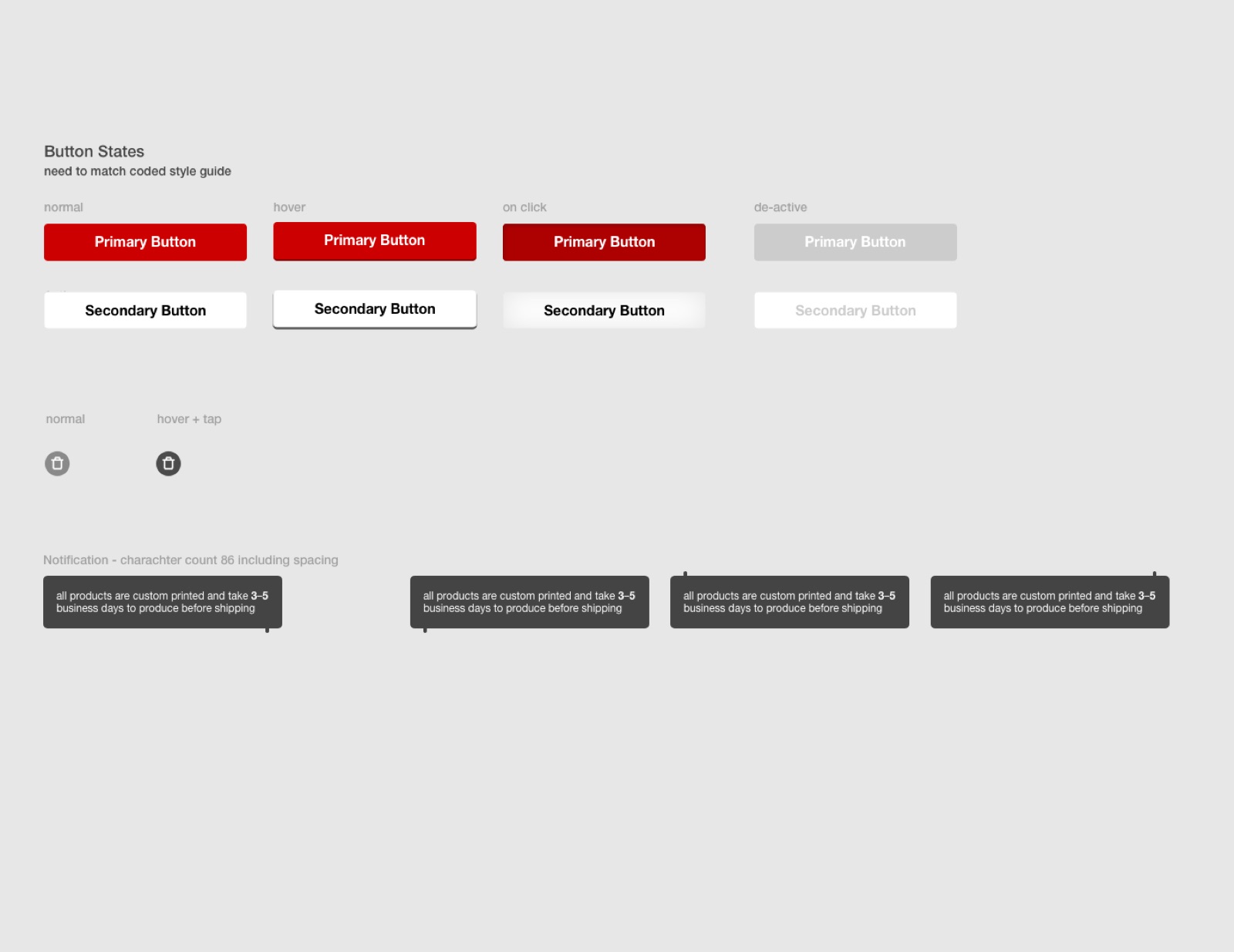
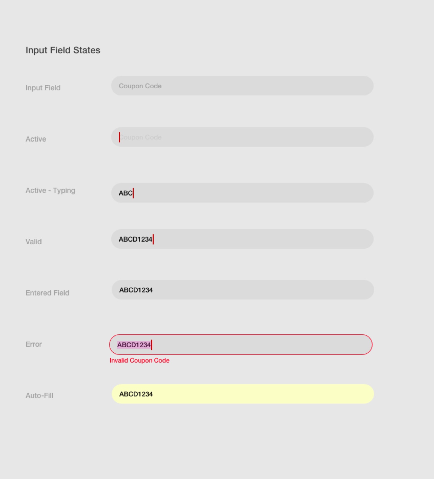
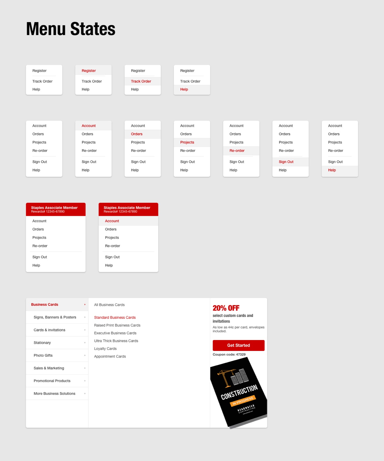
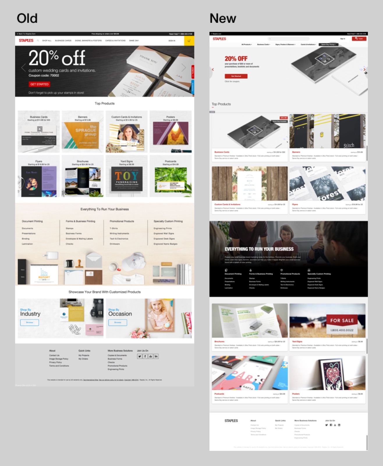
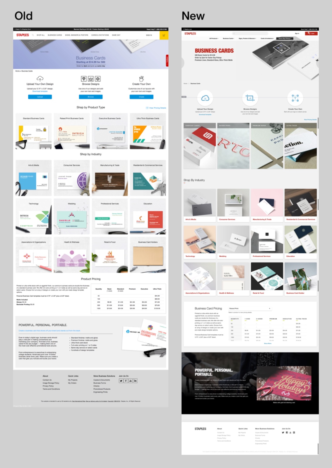
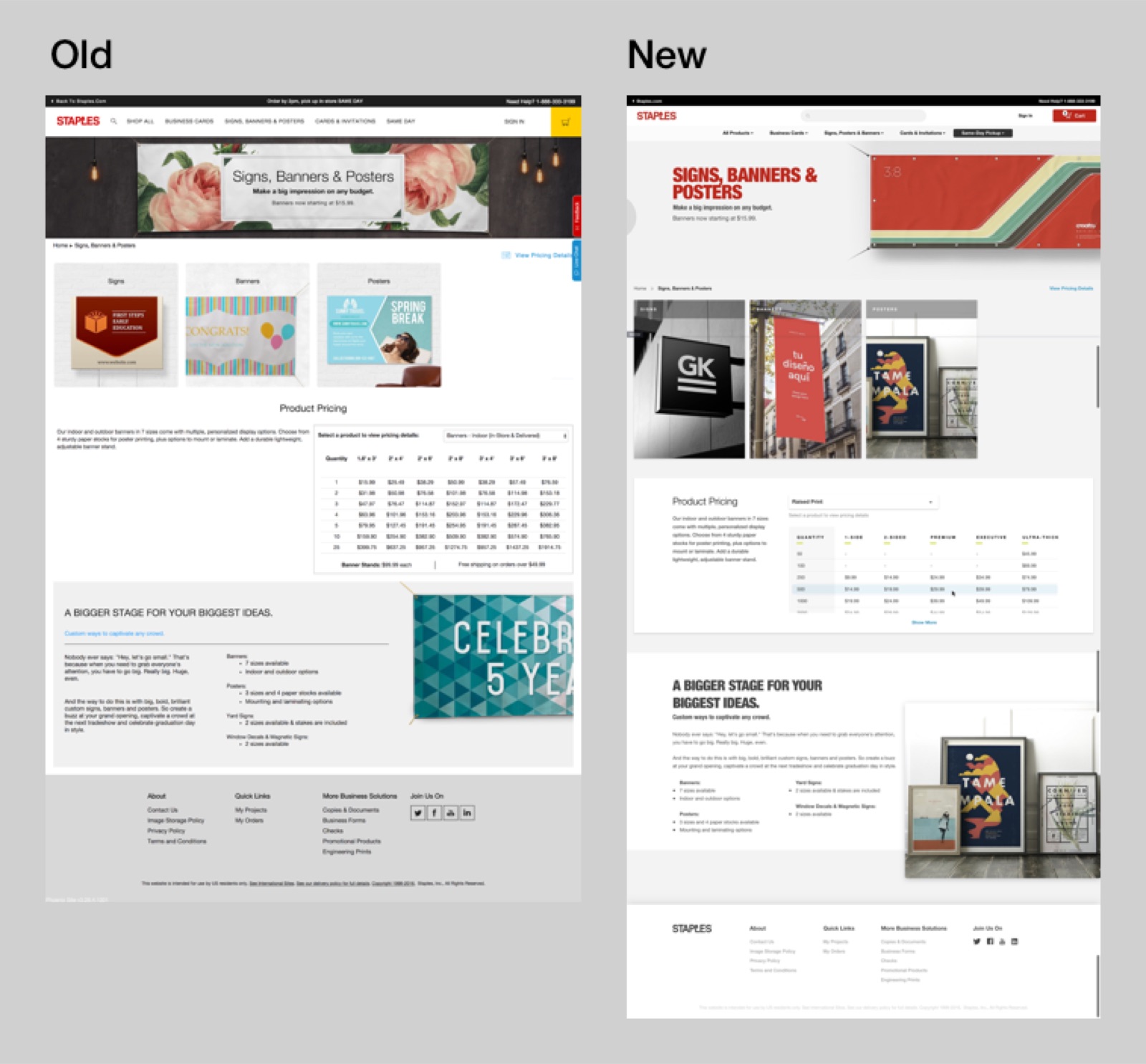
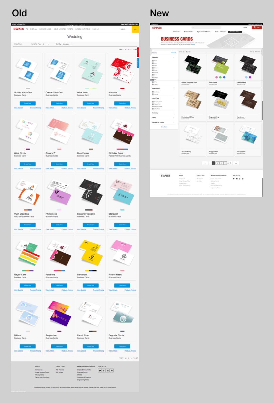
BEFORE AND AFTER
The same pages before and after the refresh. Old on the left, new on the right.
THE RESULT
Conversion on design.staples.com went from 8.6% to 15.9% after the relaunch.
HOW IT WENT
- Jan 2015Joined Staples as an associate UX designer.
- Oct 2015Started on checkout after the cart.
- May 2016New checkout launched. Sign-in and register next.
- Mid 2016Moved to design.staples.com. Audit, then the new grid.
- Feb 2018The refreshed site launched after 12 months.
WHAT I LEARNED
Staples helped me build my career. I started as an entry-level designer, took on extra projects, and found a part of the site to work on: the print store.
It taught me to think in systems, and to build reusable design systems for big brands.