THE CLIENT
An online school for South Indian classical music.
Carnatic Lessons teaches flute, vocal and dance online, with lessons, notations and practice videos. I designed the brand and a new site for them: the logo, the colours, the page structure, the screens and how each section should move.
The old site had no features: it was a single landing page with contact details. The new site was meant to open up online learning, with students able to reach their video lessons. My job was to brand it and design the look of the site.
THE LOGO
THE COLOURS
Two families, a teal and an earthy orange, each from light to dark, plus black and white.
01 · STRUCTURE
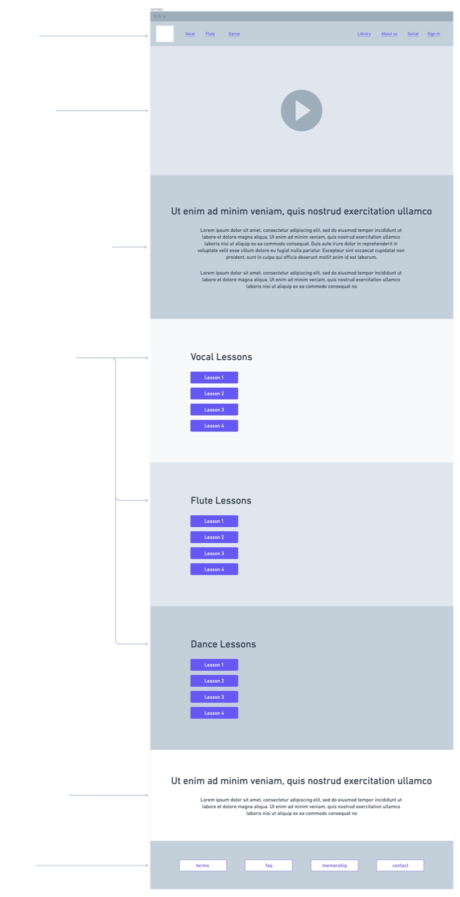
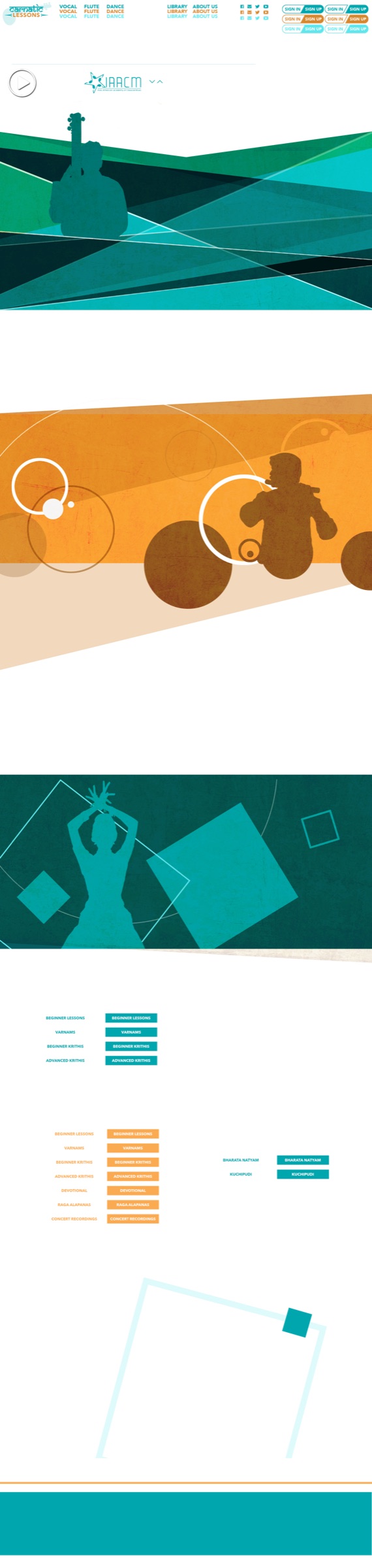
One long page. A video at the top, a short welcome, then one big section each for vocal, flute and dance, with that instrument’s lesson levels as buttons.
02 · THE SECTIONS
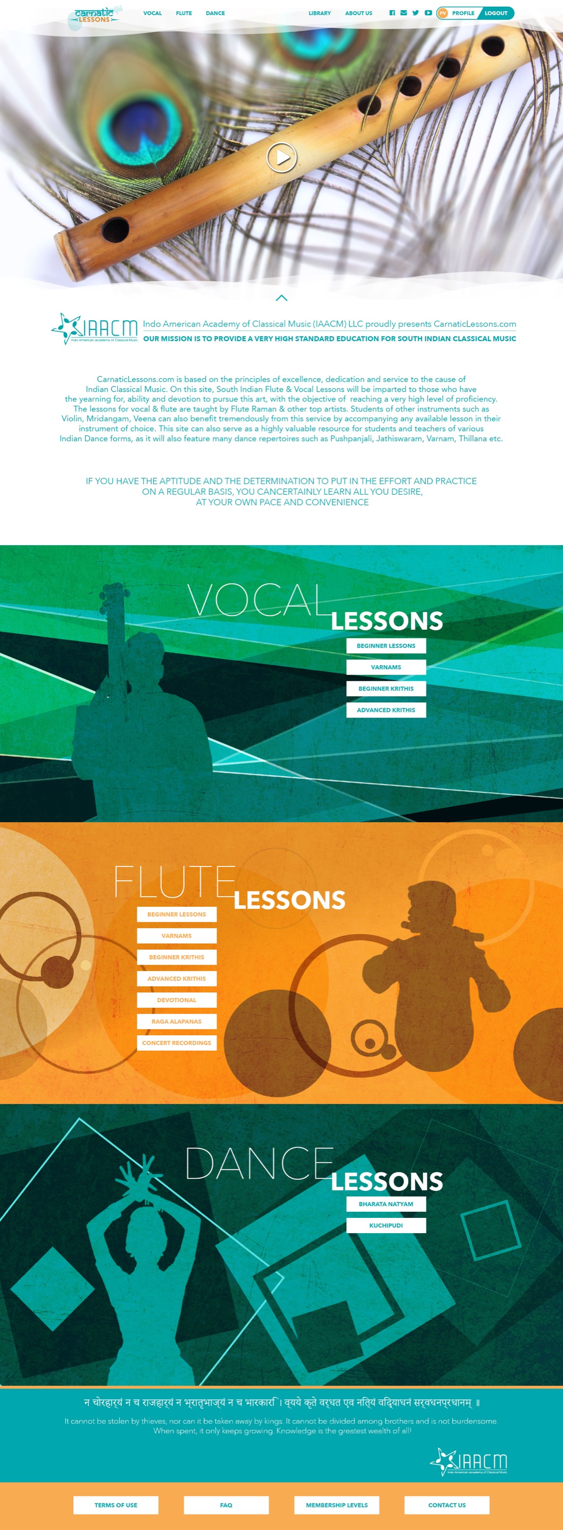
Each section has its own colour and a musician in silhouette over geometric shapes: a singer on teal, a flautist on orange, a dancer on deep teal. The shapes were made to move. This study shows the vocal section building in: the shapes slide in first, then the singer, then the lesson buttons and the title.
03 · THE SCREENS
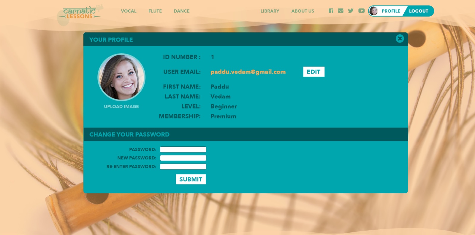
The finished homepage for a signed-in student, and the profile form.
WHAT HAPPENED
Another developer built the site. I wasn’t involved in the build. They tried to make the page feel alive the way the design did, but the motion didn’t come through. As of November 2026, the live site is their design, not mine, but it still uses my logo, the header to a degree, and some of the backgrounds I made.
WHAT I LEARNED
At the time I was a visual designer, and I wasn’t looking at the deeper structure.
I wish I had delivered a usable product, not just visuals.